Toronto-based Graphic Designer (Associate RGD) specializing in branding and packaging, with a growing curiosity for experiential design and a love for crafting memorable solutions.
Toronto-based Graphic Designer (Associate RGD) specializing in branding and packaging, with a growing curiosity for experiential design and a love for crafting memorable solutions.

ILL Magazine
ILL Magazine Embraces the “Madness” of Young Artists.
Deliverables:
Editorial, Branding
ILL Magazine
ILL Magazine Embraces the “Madness” of Young Artists.
Deliverables:
Editorial, Branding
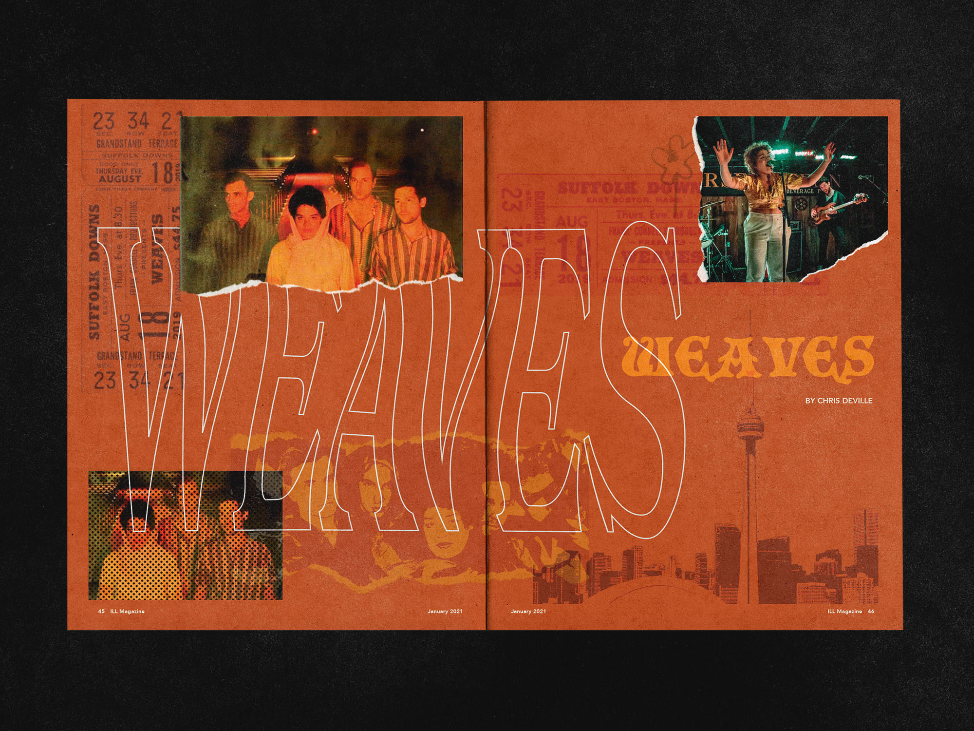
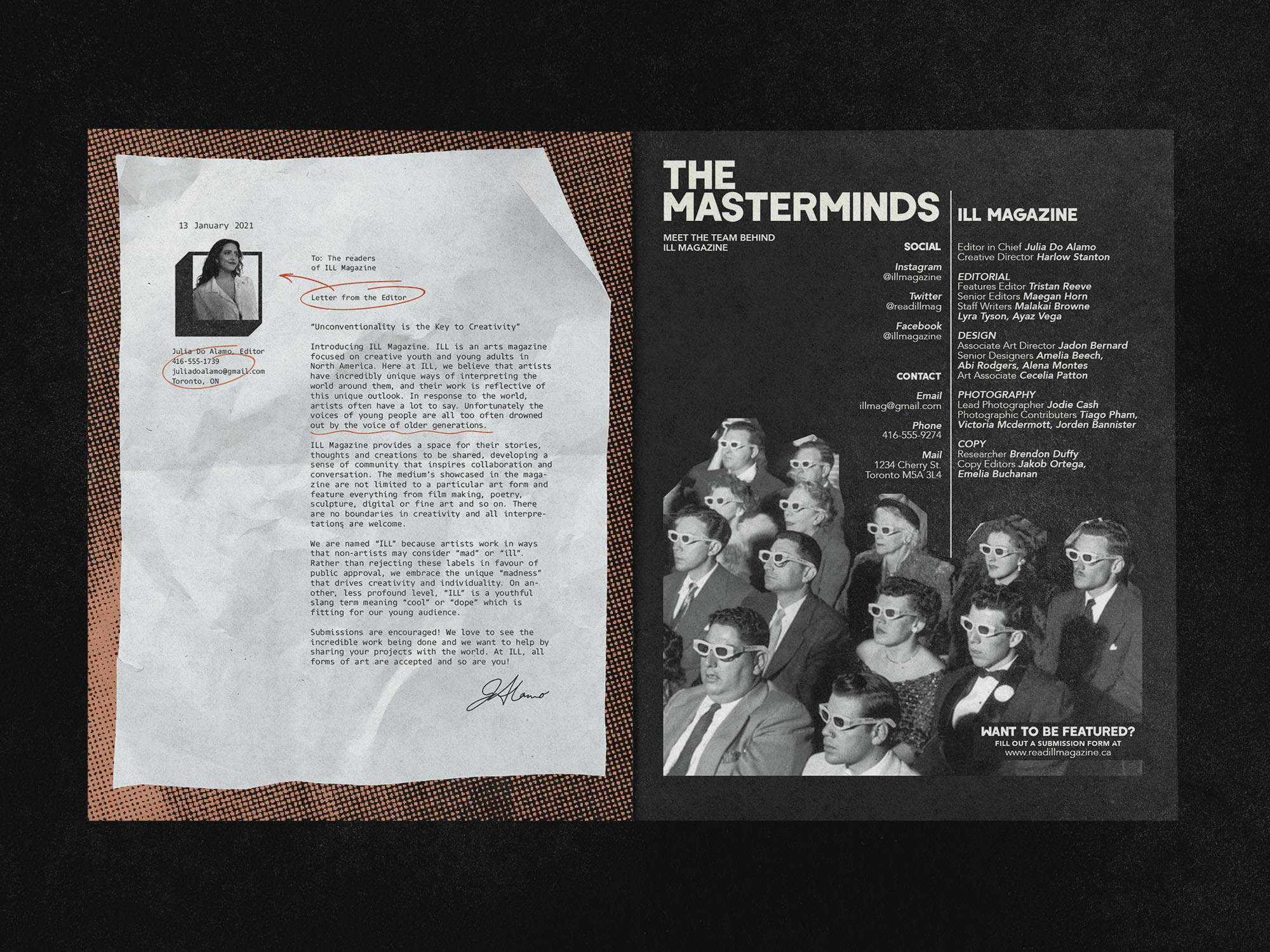
ILL Magazine is a fictional arts & culture magazine for creative youth and young adults in North America. Built around the idea that “unconventionality is the key to creativity,” ILL exists to give emerging artists a platform to share their work, stories, and perspectives in a space that feels bold, inclusive, and unapologetically experimental. The magazine spans four disciplines: Film & Photography, Literature, Visual Arts, and Music & Audio. “ILL” celebrates the unconventional, highlighting the “madness” of artists who think, work, and see the world differently. Visually and conceptually inspired by independent zines and alternative culture, ILL is designed to feel raw, expressive, and community-driven rather than polished or corporate.
ILL Magazine is a fictional arts & culture magazine for creative youth and young adults in North America. Built around the idea that “unconventionality is the key to creativity,” ILL exists to give emerging artists a platform to share their work, stories, and perspectives in a space that feels bold, inclusive, and unapologetically experimental. The magazine spans four disciplines: Film & Photography, Literature, Visual Arts, and Music & Audio. “ILL” celebrates the unconventional, highlighting the “madness” of artists who think, work, and see the world differently. Visually and conceptually inspired by independent zines and alternative culture, ILL is designed to feel raw, expressive, and community-driven rather than polished or corporate.

Process
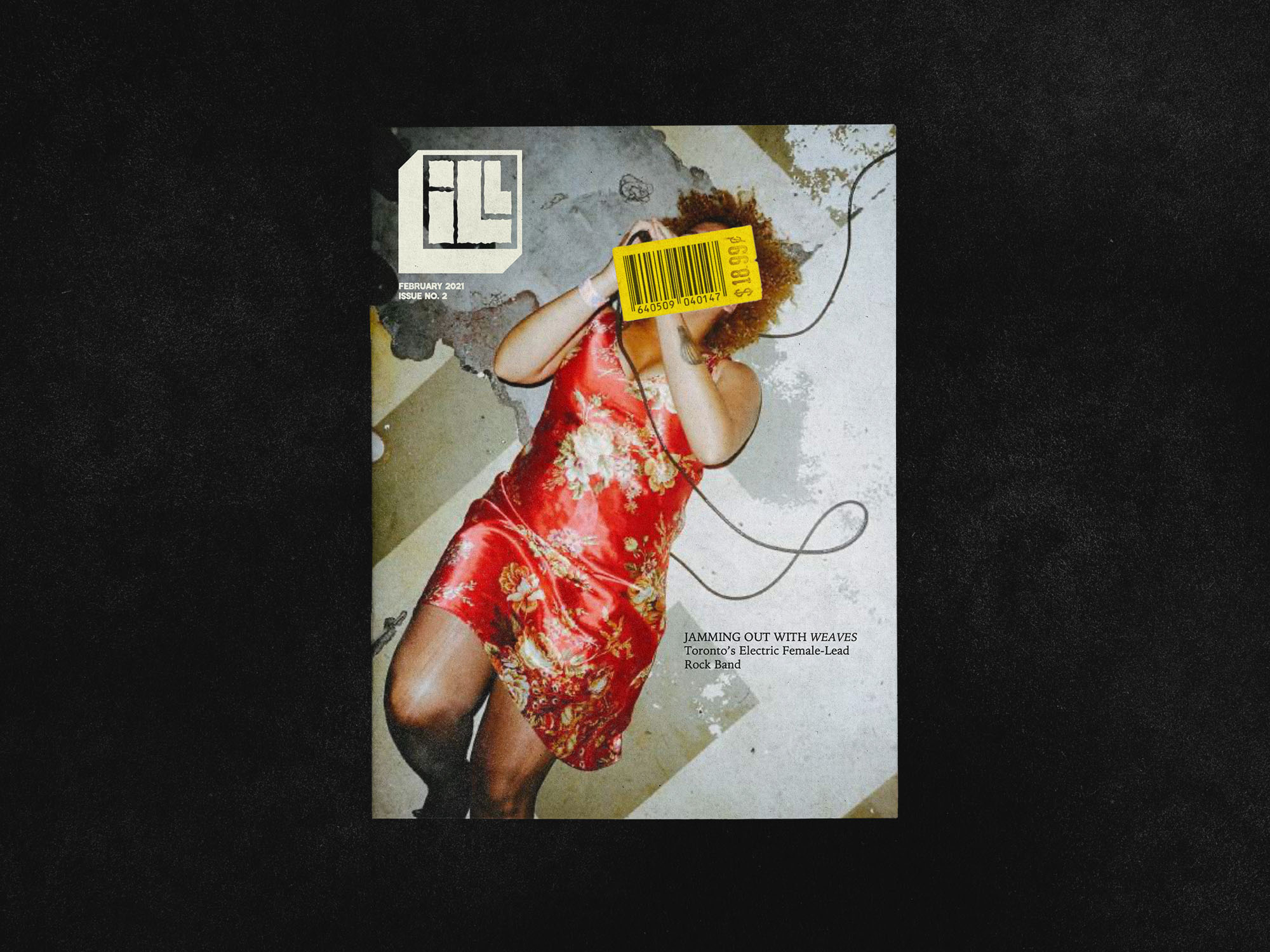
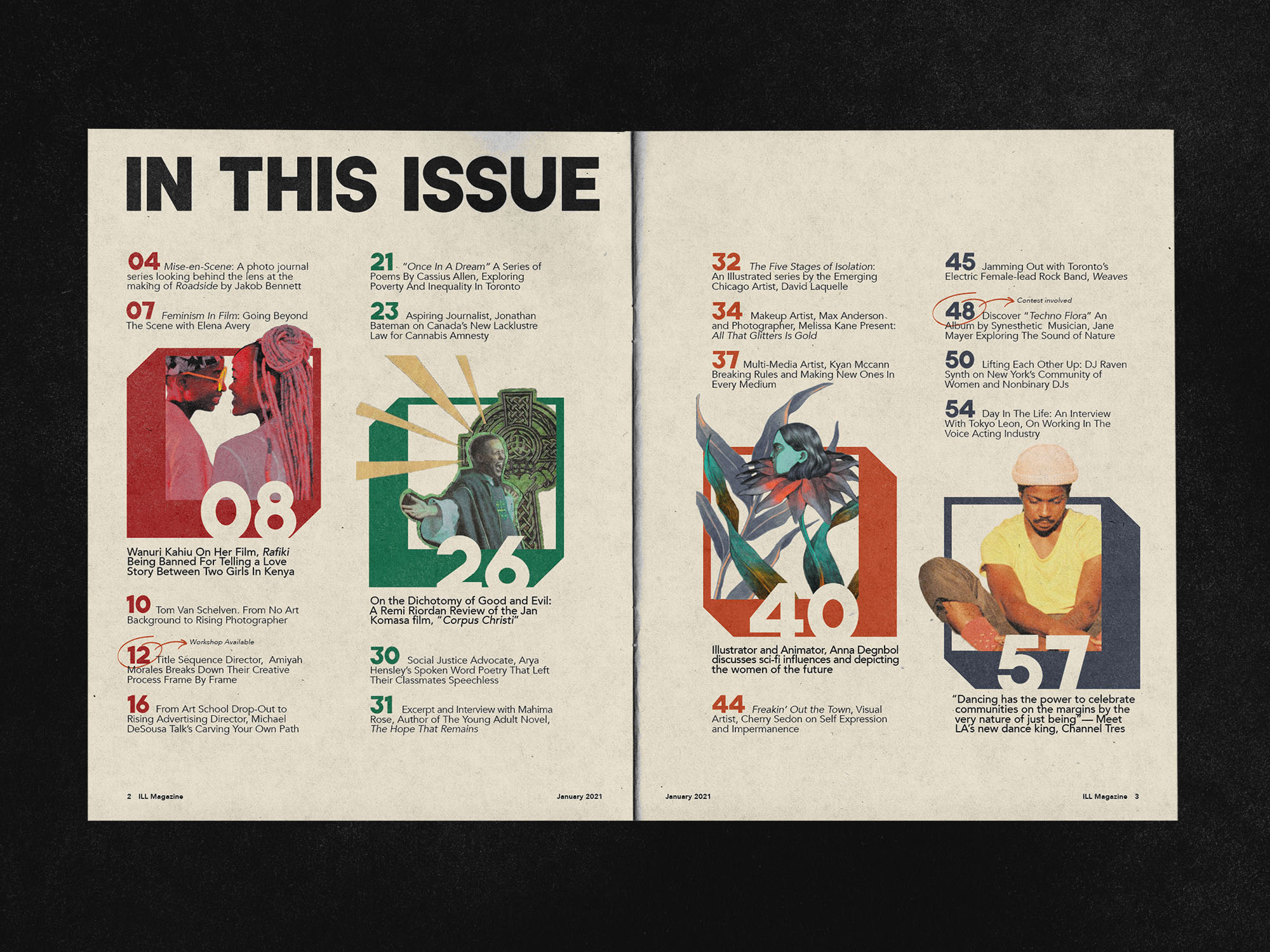
The development of ILL began by defining the audience, tone, and positioning, then moved into exploring the nameplate, cover system, and overall layouts. Multiple directions were tested, including a concert-ticket belly band and distorted typographic treatments to achieve a raw, handmade feel that reflects the magazine’s zine-like, DIY spirit. Cover designs focused on bold, high-energy imagery and a printed “sticker” for the barcode and price, turning a required element into an interactive compositional device that can partially obscure the image and entice readers to flip through. A colour-coded system organizes the four content section: Film & Photography, Literature, Visual Arts, and Music & Audio. The final result is a flexible system that adapts to different artists and mediums while remaining distinctly ILL.
The development of ILL began by defining the audience, tone, and positioning, then moved into exploring the nameplate, cover system, and overall layouts. Multiple directions were tested, including a concert-ticket belly band and distorted typographic treatments to achieve a raw, handmade feel that reflects the magazine’s zine-like, DIY spirit. Cover designs focused on bold, high-energy imagery and a printed “sticker” for the barcode and price, turning a required element into an interactive compositional device that can partially obscure the image and entice readers to flip through. A colour-coded system organizes the four content section: Film & Photography, Literature, Visual Arts, and Music & Audio. The final result is a flexible system that adapts to different artists and mediums while remaining distinctly ILL.


Outcome
The final result is a bold, modular magazine identity centered around a boxed “ILL” nameplate that acts as both a logo and a graphic device throughout the publication. A colour-coded system organizes the magazine into its four artistic sections, creating clarity while reinforcing the brand’s visual language. The cover designs feature striking, artist-led imagery and a faux printed sticker that can intentionally obscure part of the image, encouraging interaction and curiosity. The overall look is raw, playful, and expressive, capturing the energy of young creative culture and positioning ILL as a platform that celebrates experimentation, individuality, and the voices of emerging artists.
The final result is a bold, modular magazine identity centered around a boxed “ILL” nameplate that acts as both a logo and a graphic device throughout the publication. A colour-coded system organizes the magazine into its four artistic sections, creating clarity while reinforcing the brand’s visual language. The cover designs feature striking, artist-led imagery and a faux printed sticker that can intentionally obscure part of the image, encouraging interaction and curiosity. The overall look is raw, playful, and expressive, capturing the energy of young creative culture and positioning ILL as a platform that celebrates experimentation, individuality, and the voices of emerging artists.